


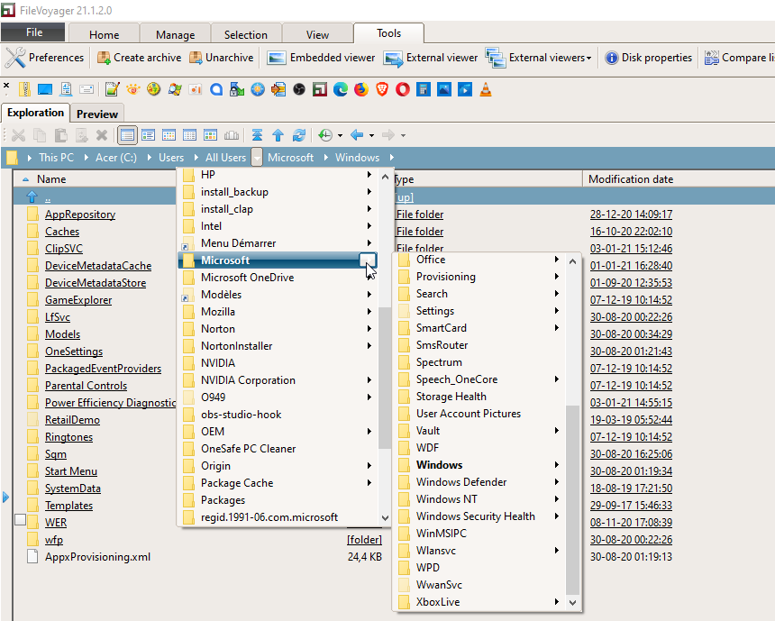
The Navigation Pane
As an OFM, FileVoyager’s Main Interface is composed of two Navigation Pane.
Each of those Navigation Panes contains similar functionalities to those found in Windows’ File Explorer.
A Navigation Pane is composed as follow:

Legend
- The Pane Tabs
- The Pane Toolbar
- The Bread Crumb address
- The Column Header
- The List
- The Folder Tabs
- The Info Pane
- The Drive Pane button
- The Tree Pane button
The Pane Tabs

In normal state, two tabs are showing: Exploration and Preview.
when the user initiates a search, an additional and temporary tab, the Search tab, appears.

The Exploration tab shows the Navigation Pane.
The Preview tab displays the file from the opposite Navigation Pane in the Viewer.
The Search tab displays the search form. It is appearance is temporary, as it disappears once the search is closed.
The Pane Toolbar
This toolbar contains actions that can be performed on the listed files and folders.

- Grip: Allows you to drag and move the toolbar.
- Cut to clipboard: Cuts the selected items to the clipboard.
- Copy to clipboard: Copies the selected items to the clipboard.
- Paste from clipboard: Pastes items from the clipboard into the current folder.
- Recycle Bin: Deletes the selected items by sending them to the Recycle Bin. This allows the possibility of restoring them from the Recycle Bin.
- Kill: Deletes the selected items without sending them to the Recycle Bin. This does not allow them to be restored (except by using specific tools).
- Details: Displays the pane in details mode.

- Large Report: Displays the pane in details mode with thumbnails.

- Icons: Displays the pane in icon mode.

- List: Displays the pane in list mode.

- Thumbnails: Displays the pane in thumbnails mode.

- Thumb Flow: Displays the pane in Details mode under a 3D view showing thumbnails.

- Go to Root: Navigate to the root of the current path.
- When in a path beginning with a drive letter, the root is the drive letter.
e.g. for “C:\MyFolder\MySubfolder” the root is “C:\” - But when inside an archive, the root is the archive’s root
e.g. for “C:\MyFolder\MyArchive.ZIP\MyZipFolder” the root is “C:\MyFolder\MyArchive.ZIP\” - When in an FTP(S), the root is the hostname part.
e.g. “ftp://192.168.0.3/MyFTPFolder/MyFTPSubFolder” becomes ftp://192.168.0.3/ - When in an UNC path, the root is the top-level folder.
e.g. “\\192.168.0.3\MySharedFolder\ASubFolder” becomes \\192.168.0.3\MySharedFolder\
- When in a path beginning with a drive letter, the root is the drive letter.
- Go up: Navigates to the upper folder.
- Refresh: Updates the item’s listing by re-reading the source content.
- History: Displays a list of the most recent visited paths.
- Backward: Navigates to the previous visited paths.
Clicking the small dropdown arrow displays a context menu with the previous visited paths, starting with the most recent. - Forward: Navigates to the following visited paths.
Clicking the small dropdown arrow displays a context menu with the following visited paths, starting with the most recent.
The Breadcrumb address
The Breadcrumb displays the path of the current listed folder. Each element of the path is clickable.
The arrows, when clicked, display a “menu” listing of the subfolders of the Breadcrumb element that precede the arrow.
Even within the “menu” listing, an item that has its own subfolders can display a submenu listing its child folders.
The Column Header
The column headers in the Details mode not only display the names of the columns, but also allow for sorting the list.
When a column header is clicked, the list is sorted based on the values in that column. A small arrow will appear next to the column name to indicate the sort order.
If the user clicks a column header that is already being used to sort the list, the sort order will be inverted.
The List
Displays the content of the current folder. See The Pane Toolbar to see how one can manipulates the list.
The Folder Tabs
Each list can contain multiple folders, and the Folder Tabs serve as bookmarks for these folders.

- Pressing this icon will create a new tab that is a duplicate of the last tab that was navigated to.
- The inactive tabs that are not currently being displayed.
- The active tab is the one that is currently showing its contents.
- Each tab has an ‘x’ icon that, when clicked, closes the tab, or it can also be closed by double clicking the tab.
- The empty space behind the last tab, when double clicked, will also create a new tab as mentioned in point 1.
Right-clicking anywhere in the Folder Tabs region will open a context menu.

- Create new tab will create a new tab and activate its content
- Create new tab back will create a new tab but leave it inactive
- Toggle lock allows the user to lock or unlock a tab. When a tab is locked, a “lock” icon will appear on the tab.
When a tab is locked and the user changes the path, the locked tab is kept and the new path appears in a newly created tab. - Close this tab closes the tab on which the Right Click was performed. If the Right Click is done on the empty space, it will have no effect
- Unlock all tabs will unlock all locked tabs
- Show or hide Folder Tabs will hide the Folder Tabs. Users who have hidden the Folder Tabs can display them again by using the Ribbon or toolbar in the Classic UI.
The Info Pane
The Info Pane provides useful information.

- Selected items:
- Number of selected items
- Between parentheses,
- Number of selected files
- Number of selected folders
- Number of selected virtual items (e.g. Control Panel)
- After the big dot (•), the size of the selected items. If folders are selected, their content is not computed for this size. Only the visible files are taken into account.
The size is also displayed in bytes between the parentheses.
- Disk usage:
- A gauge showing the percentage of used disk space. The color varies dynamically. The greener, the more free space. The more red, the more used space.
- Folder content: Describes what the folder contain:
- Number of items
- Between parentheses:
- Number of folders
- Number of files with their total size
- Current disk:
- The free size, and between parentheses, the same size given in bytes
- The total size, and between parentheses, the same size given in bytes
The Drive Pane button
This long button functions as a drawer. When clicked or hovered during a drag-and-drop operation, it displays the Drive Pane. The Drive Pane is a group of buttons that navigate the list when clicked.
The Drive Pane is divided into three categories
- Mapped drives: One button is displayed for each drive on the system.
To navigate to a specific drive, the user can either click the corresponding button or press the keyboard letter that corresponds to the drive letter.
During a drag-and-drop operation, these buttons can be used as destinations.
When a button is pressed, and the user has already navigated to that drive, the last path navigated to on that drive will be displayed. - Virtuals: Buttons that lead to virtual folders.
To navigate to a specific path, the user can either click the corresponding button or press the numeric keypad of the keyboard, where:- 0 corresponds to the Desktop
- 1 corresponds to My PC or My Computer (on systems before Windows 8)
- 2 corresponds to the Network
- 4 corresponds to the Control Panel
- User: It contains only one button that opens the Favorites Manager.
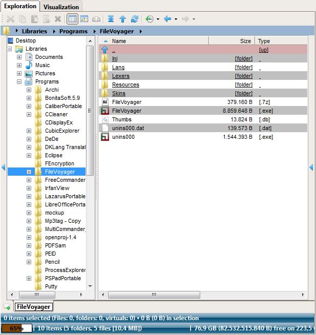
The Tree Pane button
This long button acts as a drawer. When clicked, or hovered over during a drag-and-drop operation, it opens the Tree Pane, which displays a treeview representation of the file system.
The nodes in the Tree can serve as potential drag-and-drop destinations.